
Storytelling is a critical skill for transferring information and making facts memorable. Data professionals need to be thinking about telling stories with data. Here’s the how and why.
The old way of looking at data
Many people still remember stories from childhood. Fables and parables with their colorful characters and settings taught lessons about crying wolf or disobeying parents. We remember the plot of movies and the books we’ve read. We entertain and educate each other with yarns of prior exploits and experiences. So why don’t we tell data stories?
The traditional way to look at data is with tables and charts. In many cases, this is fine – especially for comparing values or understanding distributions. But what if you want to make that data memorable?
It’s story time
Why do we tell stories and why are they memorable? First, stories create connections. These connections can be between people or concepts and/or ideas. They allow us to convey an event in history or a character in a situation. When we hear a story, our brain wants to map the action to something that already exists in our memory. We can take advantage of how our brains engage with stories to make data come to life.
Let’s look at a business story that we want to share. It’s the story of a sales team and their performance over the previous quarter. Most of us have seen this type of report, or something similar. For an example, let’s consider a table from a report delivered at the quarterly sales review meeting:
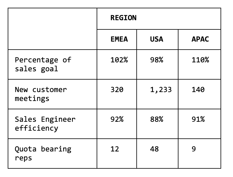

This table is factual and conveys the data we are trying to share, but will any of this be memorable? A reasonably attentive attendee may come away from the presentation with an understanding that things are all pretty good, and maybe the USA region needs some improvement to achieve parity with the other regions, and may be impressed with all those new customer touches.
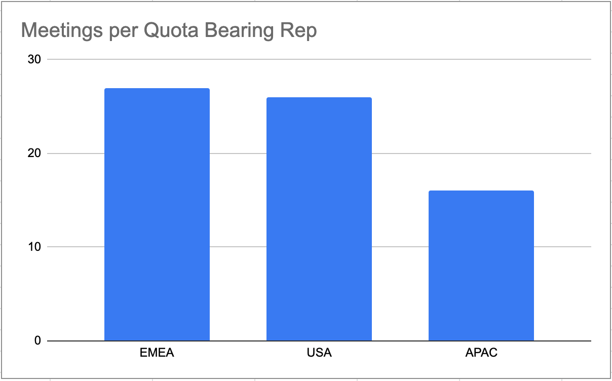
To highlight aspects of the data, it’s common to expose certain ratios as a chart. Doing so in this case exposes the fact that looking at ‘new customer meetings’ between the USA and EMEA is not as staggeringly different as it seems in the table if you consider the number of Sales Reps in each region.
The problem with bringing data into a BI tool is that we actually go back to square one when it comes to memorability. Sure, the data is all there, but it exists as columnar tables. An analyst could start building some fancy graphics for this table, but often we find that pie, line, and bar charts start losing their effectiveness with summarized data.
What is still lacking in this type of analysis is visual simplification. The goal is not only to tell a story, but for someone looking at the data to see that story as well.
Here is where graphical analysis comes in. Rather than simply spitting out numbers and tables, graphical analysis allows someone to see data objects and relationships. For example, if we want to see a sales rep’s relationship to an account, we could draw a simple graph:
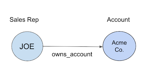
This is already feeling more like a story. We have a character (Joe, the Sales Rep) who owns an account called Acme Co. Presenting this data graphically allows any reader to understand the relationship without having any knowledge of the original data source or doing any mental mathematics or external table references.
Our story becomes even more complete with the addition of all of Sales Rep Joe’s accounts and opportunities. We will further enrich the graphic by adding object properties such as Opportunity Size and Sales Rep Quota Percentage. A note about object properties – these allow us to add color and detail to a story. The goal in visual storytelling is always to add as much detail as possible without overwhelming the eye or confusing the user.
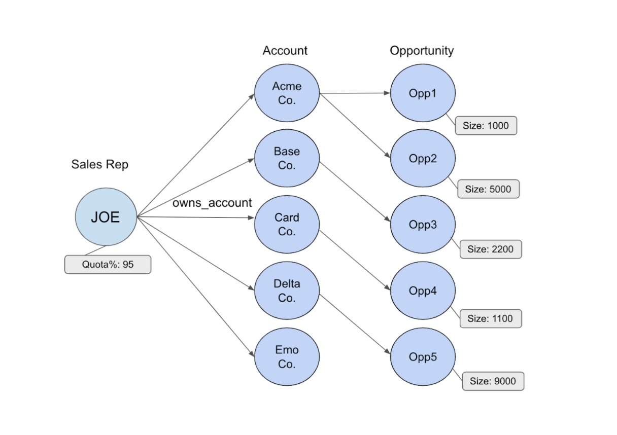
The story is now taking shape. Knowing that this data represents the prior sales quarter, we know that Sales Rep Joe was working on a handful of opportunities that had emerged from several of his accounts. In fact, one customer, Acme Co, had two different opportunities come to light this quarter. Thanks to the object properties, we can see Joe’s overall progress to his sales goal (percentage wise) and the size in dollars of each opportunity.
Let’s take this one step further to complete a story that we can share with the entire sales team. This time we’ll create some objects based on the grouping of a different property, the Opportunity Status. Grouped objects go a long way in the simplification of the overall data story. Enhancing the data with a grouped property (such as the grouped count here) maintains visual simplicity and provides more detail than forcing a viewer to do the counts themselves. An interactive visual analysis will provide additional detail or viewer drill down.
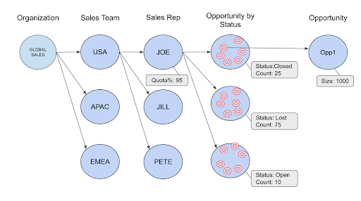
But what about the story? We’ve got Sales Rep, Joe, who in the current quarter has attained 95% of his assigned sales goal. Upon review of the quarter, he’s worked 110 opportunities. He’s closed 25 and is going into the next quarter with 10 still open, which leaves 75 deals lost. This is a great way to describe how having a larger top of funnel deal count increases the chances of sales success.
Storytelling With Data
Telling stories with data is not always the easiest of tasks, but Gemini is working hard to make this functionality more accessible to business professionals. At Gemini, we believe that data stories are the future of analysis and that business users should be able to easily and intuitively interact with data to simplify storytelling.
Storytelling Technology
In Gemini Explore – the storytelling canvas of Gemini Enterprise – we focus on four different aspects of the story:
-
Entity extraction. Those objects we’ve been referencing? Those are entities that live in your data. Entities can be users, systems, places, or concepts. Our examples have focused on entities that consist of sales reps, customers, opportunities, and corporate structure.
-
Relationships. In the examples above, relationships are defined as “owners of accounts” and “opportunities tied to an account,” but they can be any reference such as logins to a system, processes hosted on an operating system, or events reported by an endpoint protection system.
-
The combination of entities and relationships. This is the cornerstone of storytelling, and Gemini’s third aspect. Having the tools to explore the data with point and click ease is crucial for any storytelling analyst.
-
Story sharing. Stories are great for uncovering the meaning within a dataset, but they are an effect multiplier when shared with others who may have additional information or interpretations. Within Gemini Explore, you’ll find the ability to share and collaborate on storytelling.
Getting Started
If you want to see how Gemini can help you tell stories with your data, contact us to set up a discussion with our data professionals. Visit us at geminidata.com or send an email to contact@geminidata.com to schedule a consultation.